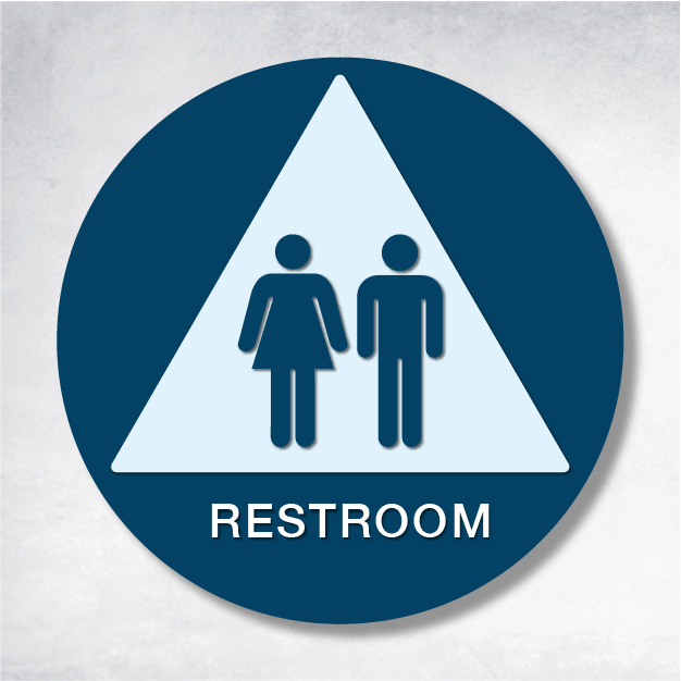
Creating spaces that are accessible to everyone is not just a legal requirement; it’s a celebration of inclusivity. ADA restroom signs are the unsung heroes of public spaces, ensuring that everyone, regardless of ability, can navigate with confidence. In this engaging guide, we’ll delve into the fascinating world of restroom signs, focusing on ADA compliance, design artistry, and practical tips to ensure your signage not only meets standards but also inspires.
Unveiling the Mysteries of ADA Restroom Signs
Decoding Pictograms and Tactile Elements
ADA restroom signs are a canvas of tactile artistry. They must feature raised characters and Grade 2 Braille, ensuring that those with visual impairments can 'read' them through touch. The pictograms, like the iconic male and female symbols, should fit within a 6" x 6" space. In California, unique symbols are required for both gendered and unisex restrooms, reflecting the state’s commitment to clarity and inclusivity.
The Art of Incorporating Laser-Etched Logos
Wondering if you can add a personal touch with a laser-etched logo? Absolutely! Laser etching not only enhances the aesthetic appeal but also ensures the durability and readability of the sign. Just remember, the logo should never overshadow the essential tactile elements, maintaining the balance between creativity and compliance.
California’s Unique Standards for Unisex and Gendered Restrooms
California’s standards are a masterpiece of their own, differing from federal ADA guidelines, especially for unisex and gendered restrooms. Dual signage is a must, with precise symbol placement to ensure clarity. Navigating these nuances is crucial for businesses in California to avoid legal pitfalls and embrace inclusivity.
Crafting the Perfect ADA Restroom Sign: A Checklist
Choosing and Placing Pictograms
Selecting the right pictogram is akin to choosing the perfect brush for a painting. Ensure the symbols are universally recognized and fit within the 6" x 6" area. This not only ensures compliance but also enhances the intuitive understanding of the sign’s message.
Validating Text and Braille
Text should be in a sans-serif font, raised, and easy to read. Braille, in Grade 2, should sit directly below the corresponding text. This validation is a critical step in ensuring both compliance and usability, making your signs a tactile masterpiece.
Guidelines for Logo Inclusion
If your creative spirit calls for a logo, let it be laser-etched. This maintains the integrity of the tactile elements. The logo should complement, not compete with, the essential information on the sign.
Ensuring Proper Mounting Height and Clearance
Mounting height and clear floor space are the finishing touches on your masterpiece. Signs should be mounted 48 to 60 inches above the ground, ensuring they are accessible to all, including those using wheelchairs.
Bringing Your Vision to Life
For those ready to transform their spaces with compliant restroom signs, explore these artistic resources:
To visualize the layout and compliance standards, dive into the ADA 2010 Standards and explore diagrams of pictogram layouts and clear floor space requirements. Before and after examples offer a gallery of insights into effective design and compliance strategies.


