


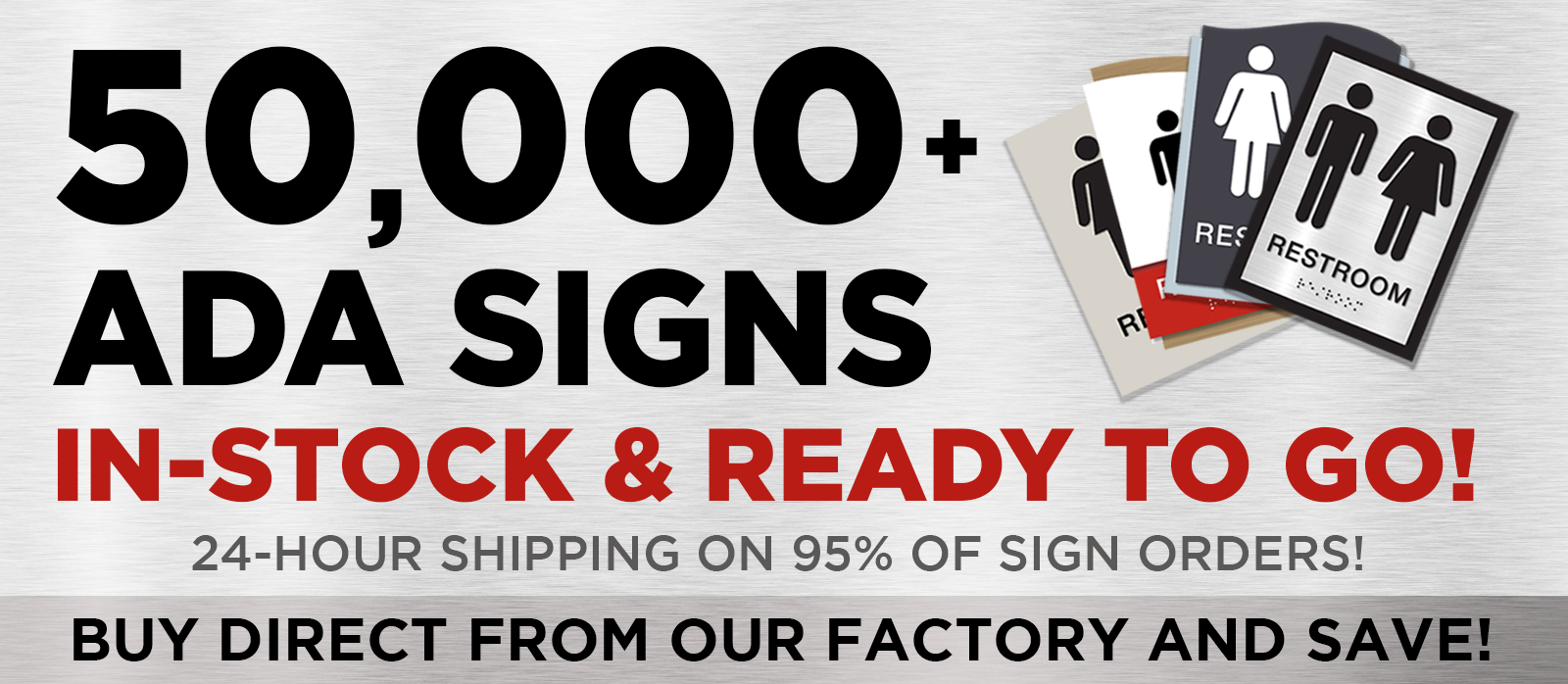
Picture this: you're in a sprawling building, perhaps an art gallery or a museum, and you find yourself lost in a maze of corridors. The key to transforming this bewildering experience into a seamless journey lies in effective signage. But not just any signage—braille directory signs that cater to everyone, ensuring accessibility and ease of navigation. Let's embark on this creative journey to design and install these essential guides.
The Art of Crafting Directory Signs
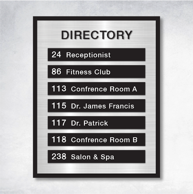
Creating directory signs is an art form that balances aesthetics with functionality. While ADA directory signage might not always require tactile elements, adding braille and raised characters can dramatically improve accessibility. Imagine running your fingers over raised characters that are at least 1/32 inch thick, crafted in elegant sans-serif fonts like Arial or Helvetica. These tactile elements, combined with high-contrast, non-glare finishes, transform signs into beacons of clarity for those with low vision. And if pictograms are your style, ensure they stand tall at 6 inches, accompanied by descriptive text that paints a vivid picture.
Gathering Your Creative Toolkit
Before diving into your project, arm yourself with the right tools and materials. Think of a painter preparing their palette. Essential tools include a tape measure, pencil, level, adhesive strips, screws, anchors, silicone construction adhesive, and brackets for those grand overhead signs. Choose materials like acrylic, aluminum, or laminated wood—durable canvases that promise longevity and withstand the test of time.
Measuring and Planning: The Blueprint of Success
Precision is your ally in this creative endeavor. Picture tactile signs mounted between 48 and 60 inches from the floor, accessible to all who seek their guidance. Directory signs should greet visitors at eye level, strategically placed near main entrances or lobbies. Ensure a clear path, free from obstructions, within 18 inches of the sign—a welcoming invitation to explore.
A Splash of Color: Customizing Your Signs
Customization breathes life into your directory signs. Imagine a high contrast between text and background, crafted from non-reflective materials that banish glare. This thoughtful design not only enhances readability but also aligns with ADA directory signage standards, creating a harmonious blend of form and function.
Installation: Bringing Your Vision to Life
The installation process is where your vision takes shape. Begin by preparing the canvas—clean and smooth the installation area. Lightweight signs find their place with adhesive tape, while heavier or exterior signs demand the strength of screw mounting and silicone adhesive. These techniques ensure your ADA directory sign installation guide is followed with precision and care.
Overcoming Challenges: Troubleshooting with Finesse
Every artist faces challenges, and signage installation is no different. Inconsistent signage or failure to meet specifications can disrupt the flow. Maintain uniformity in design and placement to reduce confusion. Adhere to character height, spacing, and finish requirements, ensuring accessibility for all.
Your Questions Answered
- How high should I mount ADA signs?: Tactile signs should grace the walls between 48 and 60 inches from the floor, with a clear floor space of 18 inches by 18 inches centered on the tactile characters.
For those seeking further inspiration, explore resources like the ADA Standards for Accessible Design and the Access Board’s Signage Guide. These references offer a treasure trove of information to support your ADA directory signage project.
By following this guide, you're not just creating signs; you're crafting experiences that enhance building wayfinding and ensure compliance with accessibility standards. With the right tools, materials, and techniques, your journey to creating effective and attractive signage is well within reach. Let your creativity guide you as you transform spaces into welcoming, navigable environments for all.


