


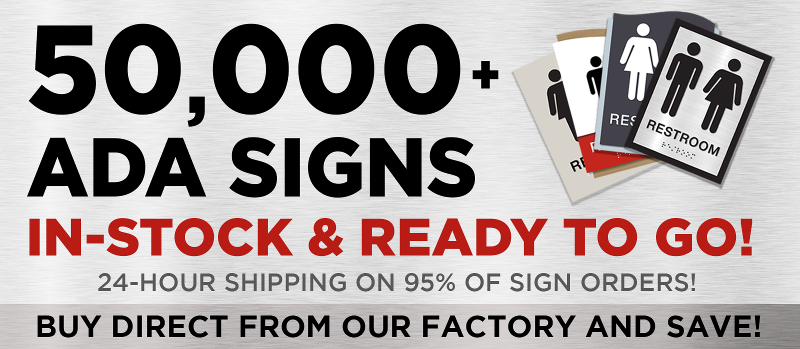
In the bustling world of commercial buildings, ensuring accessibility is more than just ticking a box—it's about creating an inclusive environment for everyone. ADA compliance, especially in braille signage, is a cornerstone of this mission. Not only does it fulfill legal obligations, but it also champions the rights and dignity of individuals with visual impairments. So, how can we ensure our commercial spaces are both compliant and welcoming?
Crafting the Perfect ADA Braille Signage
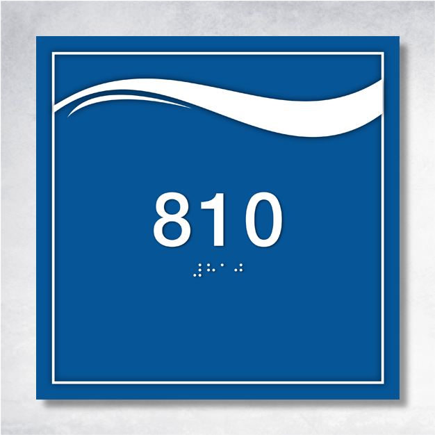
When it comes to ADA braille signs, the devil is in the details. These signs are meticulously designed to ensure that everyone, regardless of their visual ability, can navigate public spaces with ease. Key elements include the strategic placement of signs, the size of characters, precise braille specifications, and the finish and contrast of the signage. Imagine walking through a building where every sign is at the perfect height, with clear, discernible characters and braille, all set against a non-glare finish with high contrast. This attention to detail transforms a simple sign into a beacon of accessibility.
Installation: The Unsung Hero of Compliance
The installation of ADA compliant braille signs is akin to setting the stage for a flawless performance. A sign placed at the wrong height or location can turn a helpful guide into a source of confusion or even a safety hazard. Adhering to ADA standards for installation not only ensures compliance but also enhances the experience for individuals with disabilities. Think of it as choreography—each sign placed with precision, guiding visitors seamlessly through the space.
Materials and Design: The Art of Braille Signage
Choosing the right materials for ADA braille signs is like selecting the perfect canvas for a masterpiece. Durability and readability are paramount, with materials such as acrylic, aluminum, photopolymer, and wood offering distinct advantages. Acrylic and aluminum boast durability, while photopolymer provides design versatility. The design should feature non-glare surfaces and high contrast, ensuring readability in any lighting condition. This thoughtful selection not only prolongs the life of the signage but also amplifies its effectiveness.
Sidestepping Common Pitfalls
Even with clear guidelines, common mistakes in ADA signage can occur. These range from installation errors, like incorrect height or placement, to design flaws such as insufficient contrast, and manufacturing issues that compromise readability. Avoiding these pitfalls requires a keen eye for detail and a deep understanding of ADA requirements. Collaborating with experts and investing in high-quality materials can significantly reduce these risks, ensuring your signage serves its purpose flawlessly.
Embracing Continuous Compliance
ADA compliance is not a one-time task but an ongoing commitment. Regular reviews of your braille signage can help catch and correct issues before they escalate. Engaging with ADA compliance specialists can provide invaluable insights, ensuring your building remains accessible and up-to-date with current standards. It's about creating a space that is not only compliant but truly welcoming to all.
In the end, ADA braille signage is more than a regulatory requirement—it's a testament to a building's commitment to inclusivity and accessibility. By mastering the requirements, ensuring precise installation, choosing the right materials, and avoiding common mistakes, you can create a space that is both compliant and inviting. Consider scheduling a compliance review today to ensure your building is a model of accessibility and a welcoming haven for all visitors.
Relevant Links from BrailleSignWholesale
- Epsilon - Room ID C 8" x 6" - ADA Compliant Braille Sign
- Zeta - Room ID A 6.5" x 4.5" - ADA Compliant Braille Sign
- Lambda - Cubicle Name Plate B 10" x 3.5" - ADA Compliant Braille Sign
- Epsilon - Stair ID 6" x 8" - ADA Compliant Braille Sign
- Epsilon - Flag Mount Corridor Sign C 8" x 8"


