


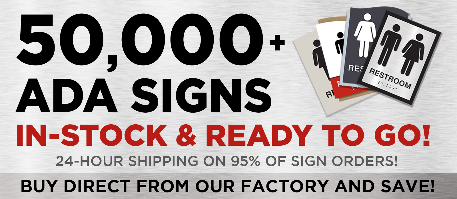
Navigating the World of ADA Signs: Your Guide to Compliance and Accessibility
Steering Clear of Costly Missteps
Imagine walking into a building where every sign seamlessly guides you to your destination, ensuring everyone, regardless of ability, feels welcome and informed. This is the power of choosing the right ADA sign. Not only does it ensure compliance, but it also saves you from potential fines and enhances the overall experience for all visitors. Let’s embark on a journey to discover how you can select the perfect ADA sign for your space.
Demystifying ADA Signs
What Makes an ADA Sign Essential?
ADA signs are more than just markers; they are beacons of accessibility. Designed with both visual and tactile elements, these signs are crucial for room identifiers, exit signs, and directional guidance. While temporary signs and directories may not require ADA compliance, the importance of these signs in creating an inclusive environment cannot be overstated.
Why the Right ADA Sign Matters
Choosing the right ADA sign is not just about ticking a compliance box. It’s about ensuring that every individual can navigate your building with ease. Non-compliance can lead to legal headaches, but more importantly, it can alienate those who rely on these signs for accessibility. The right signage transforms a space into a welcoming haven for all.
Equipping Yourself: Tools and Materials
Types of ADA Signs: A Quick Guide
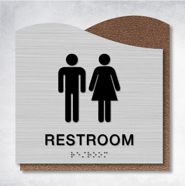
From room identifiers to restroom signs, the variety of ADA signs is vast. Your choice should align with the specific needs and layout of your building. Consider options like the Sigma Directory Sign or the Omega Restroom Sign to meet your requirements.
Step-by-Step to the Perfect ADA Sign
- Understanding Your Sign’s Purpose: Is your sign guiding someone to a room, assisting with navigation, or serving another function? This fundamental question will steer your design and placement decisions.
- Material Matters: Selecting the right material is crucial. Opt for durable, non-reflective options like acrylic or metal to prevent glare and ensure longevity. Remember, the finish should be non-glare to comply with ADA standards.
- Tactile Elements: A Must-Have: Incorporate tactile elements such as raised text and Grade 2 Braille. High-contrast lettering is essential for visibility, ensuring that everyone can read the sign with ease.
- Mounting: Getting It Right: Mounting your sign correctly is key. Ensure it’s at least 48 inches from the floor with clear floor space around it for accessibility. This small detail can make a big difference.
- Customization with Compliance: While it’s tempting to add brand colors and logos, ensure these elements don’t compromise ADA compliance. Striking the right balance is crucial.
Overcoming Common Challenges
Troubleshooting Your ADA Sign
If your sign doesn’t pass an ADA audit, don’t panic. Review tactile and visual elements, check the mounting height, and ensure contrast. Small tweaks can often rectify compliance issues.
Creating a Welcoming Environment
By following this guide, you’re not just avoiding costly mistakes; you’re creating a space that’s accessible and welcoming to all. Your building will not only meet legal standards but also provide a seamless experience for every visitor.
Explore More Resources
Dive deeper into ADA compliance with our ADA Signage Guide or watch our video demo comparing Acrylic vs. Metal ADA Signs. These resources will equip you with the knowledge to make informed decisions.


