


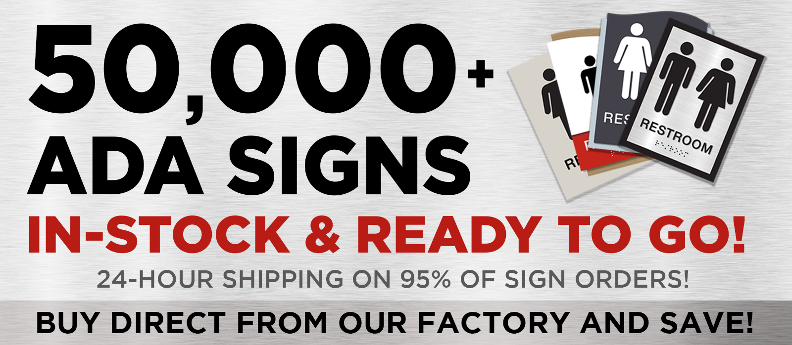
ADA Signage: Your Guide to Creating Inclusive Spaces
In the world of design and architecture, creating spaces that are inclusive and accessible is not just a legal requirement—it's a moral imperative. At the heart of this mission lies ADA signage, a crucial element that ensures everyone, regardless of ability, can navigate spaces with ease. This guide delves into the essentials of ADA signage, offering insights and practical advice to help you meet compliance standards while fostering an inclusive environment.
The Art of Accessibility: Understanding ADA Signage
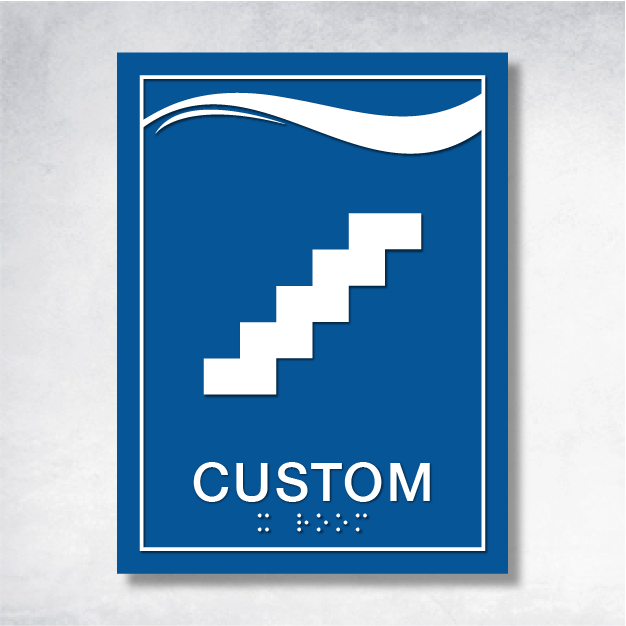
ADA signage is more than just a legal checkbox; it's a bridge to inclusivity. These signs are strategically placed to guide and inform, ensuring that individuals with disabilities can move through spaces with confidence. Key features include tactile characters, Braille, high contrast, and intuitive symbols—each element crafted to enhance readability and understanding for all, including those with visual impairments.
Questions You Didn't Know You Needed to Ask
- What are Tactile Characters? These are raised letters or numbers on signs, designed to be felt by touch. They provide essential information for those who are blind or have low vision.
- Why is Braille Important? Braille on ADA signs ensures that information is accessible to those who read it. Specifications for Braille include precise size, spacing, and positioning.
- How Does Contrast and Finish Matter? High contrast between text and background is vital for readability, while a non-glare finish enhances visibility in various lighting conditions.
- What Role Do Pictograms and Symbols Play? These universal symbols convey messages quickly, aiding those who may not read English or have cognitive disabilities.
Your Go-To Checklist for ADA Compliant Signage
- Design with Purpose: Ensure signs meet design specifications, using simple, sans-serif fonts and appropriate color contrast.
- Strategic Placement: Mount signs at a height accessible to all, typically between 48 and 60 inches from the floor, in locations that are easy to find and read.
- Know the Scope: Be aware of where ADA signs are required, such as restrooms, exits, and accessible routes.
- Stay Legal: Understand the legal implications of non-compliance, which can lead to fines and lawsuits. Compliance not only avoids penalties but also promotes inclusivity.
- Keep Up with Changes: Stay informed about updates in ADA signage requirements, including new design standards and technological advancements.
Avoiding Pitfalls: Common Mistakes in ADA Signage
- Overlooking Tactile Needs: Tactile elements are crucial for accessibility—don't skip them.
- Poor Font Choices: Decorative fonts may look appealing but can hinder readability and compliance.
- Ignoring Contrast: Ensure text stands out against the background for maximum readability.
- Incorrect Mounting Heights: Follow guidelines to ensure signs are accessible to everyone.
- Neglecting Local Codes: Federal requirements are just the beginning; local codes must also be followed for full compliance.
Dive Deeper: Resources for Mastering ADA Signage
Embracing Inclusivity Through ADA Signage
By prioritizing ADA signage, you're not just avoiding legal penalties—you're championing a cause that makes spaces welcoming and accessible to all. Audit your current signage, consult with ADA specialists, and explore the resources provided. Through these efforts, you contribute to a world where everyone can navigate spaces with dignity and ease. Let's create environments that celebrate diversity and inclusivity, one sign at a time.


